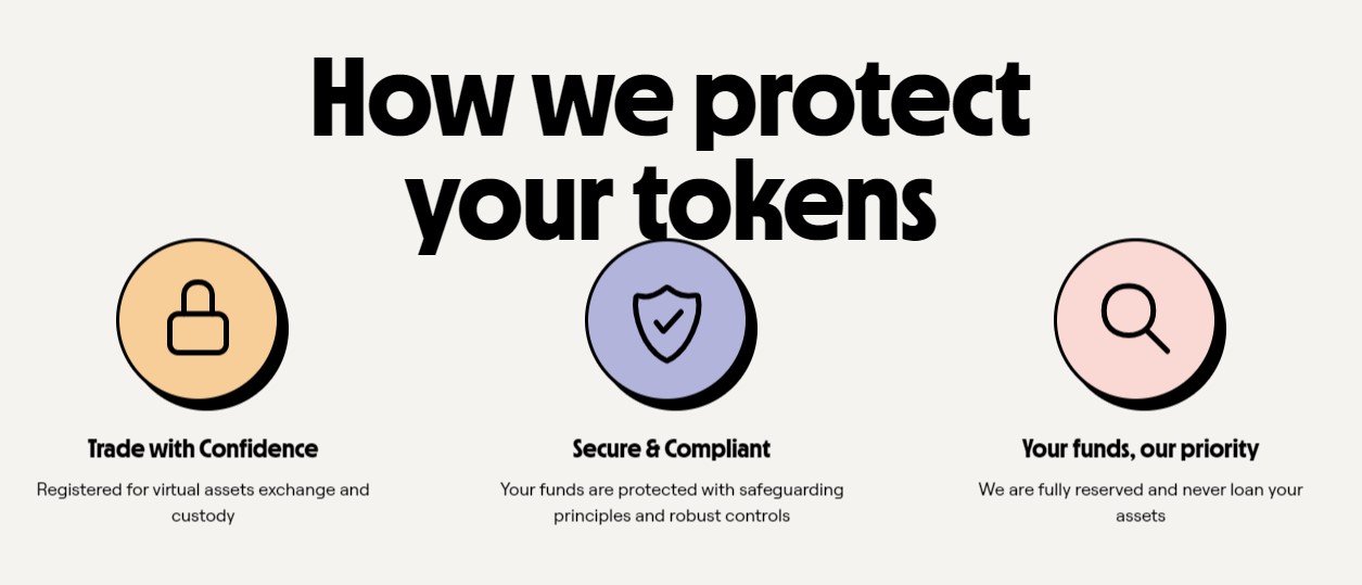
Crypto marketplace token.com has partnered with creative company 20something to reveal a new brand strategy and visual identity. token.com launched in 2017, and the crypto company’s brand makeover comes hot off the tails of a competitive pitch.
Given crypotocurrency’s volatile and complex nature, most crypto exchange platforms mimic trading platforms, deviating from mainstream purposes. As such, it can be a place of confusion that may discourage new users from joining, catering to full-time crypto trackers and users instead.
Based on this understanding and its challenges, token.com’s rebrand centres around the idea to ‘Invest with Intent’. Moving away from the usual relationship between users and crypto, the new outlook heads towards value-led investments in projects and genuine interests.

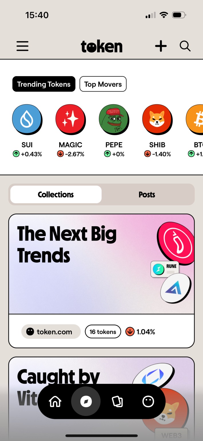
Moreover, the ‘Intent’ portion of the idea is a dominant factor in User Experience (UX) design. As solving customer intentions drive strategic UX designs, token.com’s platform update is optimised for quick, easy searches and to help them make well-calculated decisions.
Along with 20something and ON for digital design and development, token.com’s refurbished website and app bring a new digital experience to its forefront. Visually, the platform features striking illustrations by illustrator Bertrand Aznar – a breath of fresh air compared to other crypto platforms.

By doing so, token.com takes a step towards being a social platform rather than a regular digital crypto trading place. Its ultimate goal is to create a more humanised approach for cryptocurrencies and tokens, while making it convenient and within reach for users. With that, the audience will understand better what they’re investing in for their future.


