Music consumption has undergone a revolutionary transformation, primarily driven by technological advancements in the digital era. As of 2023, Spotify boasts a staggering $16 billion valuation, cementing its global success as a dynamic music, podcast, and video streaming platform, most commonly due to its trending ‘Spotify logo.’
With a widespread presence across various devices and operating systems, the app has captivated audiences worldwide since its inception. By May 2018, the platform had attracted approximately 170 million monthly active users, catering to diverse tastes from true crime podcasts to the latest chart-topping albums and music videos.
One brand that has undeniably revolutionized the music streaming industry is Spotify. With its iconic logo omnipresent, the Spotify logo has become synonymous with easy accessibility, modernity, and a seamless musical experience.

Spotify Logo Meaning: Delving into the Elements
The design principles underpinning Spotify’s official logo are harmonious alignment of all its elements. With a vibrant green hue and a legible sans-serif font, the circular logo emanates a contemporary appeal that resonates with its tech-savvy audience.
A Square:
Spotify’s logo initially featured a rounded square, embodying multifaceted symbolism. The square signifies stability and reliability in the business world by representing cardinal directions. Its rounded form adds a touch of approachability and softness to the overall logo design.
A Circle:
In its current form, the Spotify logo showcases a solid circle serving as the backdrop for the brand’s name, represented by three arc-shaped lines. The circle symbolizes eternal elements while portraying a sense of community and infinite connectivity. This shape underscores Spotify’s commitment to providing timeless music experiences, reflecting its integrity and dedication to the music world.
Sound Waves:
An integral aspect of all Spotify logotypes is the depiction of sound waves through three horizontal lines, representing the essence of musical energy and fluidity. These lines convey a sense of calmness and distance. Further, this encapsulates the infinite possibilities that music brings to life, aligning seamlessly with Spotify’s core identity as a music-centric company.

The Spotify Logo Colors:
Black Color:
Spotify’s wordmark exudes an air of mystery and sophistication, symbolizing power and elegance by utilizing black as its primary color. This color choice is deliberate, as it evokes a range of emotions, emitting positive vibes that align perfectly with Spotify’s brand ethos.
White Color:
Contrasting with the bold black color, the white in the Spotify logo symbolizes purity, cleanliness, and innocence. Often associated with freshness and simplicity, white further emphasizes the brand’s commitment to delivering a seamless and refreshing musical journey to its global user base.
Green Color:
Since its inception, Spotify has prominently featured a green background, reflecting the brand’s association with growth, vitality, and serenity. Evocative of the natural world, Spotify Green embodies wealth, rejuvenation, and a sense of progress. Further, it resonates with Spotify’s mission to provide a soothing and prosperous musical oasis for its millions of users worldwide.
Spotify Font:
Crafted in a distinct sans-serif font, resembling a modified Gotham typeface, the Spotify logo prioritizes legibility and easy identification. Its bold and straight lines contribute to the logo’s readability and effectively convey the brand identity that Spotify seeks to communicate to its diverse audience.

Spotify Logo History
Established in 2006 as a pioneering music streaming service, Spotify has transformed how people discover and enjoy music, podcasts, and videos. Since its inception, the company’s value has soared to an impressive $16 billion, solidifying its position as a leading force in the digital music and entertainment industry.
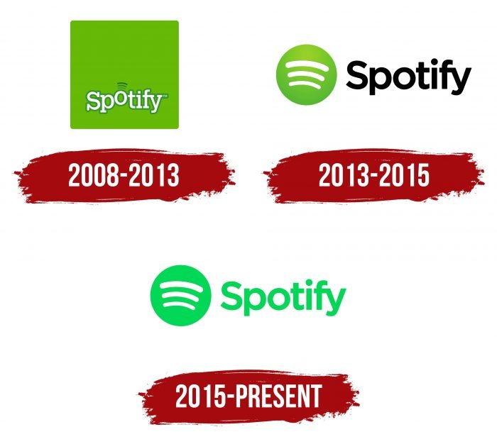
From its humble beginnings, the first Spotify logo, introduced in 2008, sported a unique blend of a white serif font set against an avocado green backdrop. The original logo exuded a distinctive charm that set it apart from other contemporary branding approaches. This is due to the feature’s subtle sound wave elements.
In the subsequent years, Spotify underwent a series of marketing icon redesigns, culminating in its current iteration, which showcases a vibrant and captivating design that seamlessly combines simplicity with visual appeal.
Through strategic alterations to its logo, Spotify has successfully maintained its core brand personality, reflecting its unwavering dedication. Through this, it delivers an unparalleled music streaming experience to its ever-expanding global user base.
Spotify Logo Evolution

Over the past 12 years, Spotify has undergone two significant app logos updates, each carefully orchestrated to uphold its brand integrity and resonate with its growing audience. While the logo’s aesthetic elements have evolved, the fundamental essence of Spotify’s identity has remained resolute. Consequently, it reinforces the brand’s commitment to staying ahead of the curve in the ever-evolving music streaming landscape.
The First Spotify Logo (2008):

Spotify podcasts logo featured a unique blend of white serif fonts against a green backdrop, accentuated by subtle sound wave elements. This way, it marks its initial foray into the digital music realm. This design choice highlighted Spotify’s early devotion to a distinctive and memorable visual identity, setting the stage for its future branding endeavors.
2013 to 2015: (Redesign)

In 2013, Spotify went through a comprehensive logo overhaul, discarding the wordmark and square elements in favor of a sleek, minimalist approach. The redesigned logo featured a striking lemon-green circle adorned with three arc-shaped lines in white. Further, it accentuates a clean, distinctive aesthetic that reflects the company’s evolving trajectory and growing influence in the digital music sphere.
2015 to the Present:

Spotify’s logo received a subtle yet impactful redesign in 2015, building upon its previous iterations. Furthermore, incorporating a vibrant green color scheme exuded a more dynamic and contemporary appeal. With the circular emblem and wordmark adorned in a bright green hue, the logo radiated a sense of modernity and freshness, reaffirming Spotify’s position as a trailblazer in the music streaming industry.
Why the Spotify Logo Works
The iconic green Spotify logo has garnered widespread acclaim for its minimalist yet compelling design, emphasizing the strategic use of color, shape, and typeface. The logo remains recognizable and adaptable across various advertising platforms. Consequently, it reflects Spotify’s unwavering dedication to brand integrity and consistency.
Moreover, the Spotify logo, embraced by a vast and ever-growing audience, has played a pivotal role in fostering trust and loyalty. This way, it serves as a powerful emblem that resonates with the brand’s core values and diverse user base.

Final Thought
In a highly competitive digital landscape, the significance of a memorable artist logo cannot be overstated. As an integral component of Spotify’s overall branding strategy, the Spotify logo serves as a beacon of engagement, allure, and distinction, capturing the essence of the brand’s identity and seamlessly integrating with its app design, website interface, and various promotional mediums.


