Consumers remember brands for their memorable brand logos and catchy jingles or songs, but another way is with a distinctive, custom typeface.
What is the difference between a font and a typeface? A typeface is a broad term to describe where fonts live. For instance, Montserrat is a typeface, whereas Montserrat Medium is a font. A typeface can have many fonts: Montserrat has at least nine with different font weights.
15 Brands With Their Own Custom Typeface
1. Airbnb
Introduced in 2018 and as part of its 10th anniversary is the Airbnb typeface, Airbnb Cereal.

The sans serif typeface has rounded, geometric properties that help the brand appear friendlier and more approachable. Crafted for digital and physical platforms, the typeface consists of six fonts: Light, Book, Medium, Bold, Extra Bold, and Black.
2. Apple
Apple’s official typeface is San Francisco and appears on screens and Apple keyboards. Easy to read and language-adaptive, San Francisco comprises up to nine weights (including italics) and several extensions.

The San Francisco typeface features three variants: SF Pro, SF Compact, and SF Mono. Besides those, Apple’s New York typeface is a serif companion for San Francisco. Additionally, script extensions that support other languages are SF Arabic, SF Armenian, SF Georgian, and SF Hebrew.
3. BBC
Named after its founder, John Reith, the BBC uses its official BBC Reith typeface in all mediums.

With a contemporary humanist style, the typeface contains three parts: a Sans Serif, Serif, and Condensed Sans option. The typeface also has up to five different fonts and can adapt to Latin and Cyrillic characters.
4. CNN
From breaking news headlines to digital reports, CNN Sans is the typeface to rule them all in the newsroom.

Bearing design similarities to Helvetica, the typeface is clear, uniform, and has up to 30 unique fonts.
5. Coca-Cola
Coca-Cola has two distinct typefaces – its signature Coca-Cola text and its accompanying script. The main Coca-Cola wordmark was designed by Frank M. Robinson, Coca-Cola’s bookkeeper, who adapted the Spencerian typeface into one of the world’s most recognisable logos.

On the other hand, the secondary typeface, the TCCC Unity, was developed by Brody Associates. The typeface has two font weights, Regular and Bold.
6. Duolingo
Duolingo is a language company with typography as a form of brand expression. In headlines and phrases containing the brand’s name, it uses the Feather Bold typeface, while Din Next Rounded is a secondary option.

Besides those is Nunito, a substitute that shares visual similarities like rounded caps and friendly attributes.
7. Goldman Sachs
Released in 2020, Goldman Sachs’ custom typeface, Goldman Sans, is a clean sans serif designed for the company’s data-rich environment and numbers.

For fonts, Goldman Sans has 11 weight types: two condensed weights, three italic weights, and six Roman weights.
8. Google
Product Sans is a geometric sans serif typeface custom-made for Google as part of its corporate branding. The typeface is exclusive and cannot be used outside of the brand. A well-known example of its usage is the Google logo, which was updated in 2015 with the Product Sans typeface.

9. IBM
IBM’s IBM Plex typeface is Grotesque-styled, a style that occurred during the Industrial Age, aptly when IBM was born. The typeface is loosely based on Helvetica but with open-angled terminals and counter forms for better legibility.

IBM Plex has eight fonts and supports global languages such as Arabic, Cyrillic, Devanagari, Greek, Hebrew, Japanese, Korean, and Thai.
10. Intel
In 2005, Intel used a customised Neo Sans typeface called the Neo Sans Intel. Several years later, the company developed the Intel Clear typeface with Dalton Maag and Red Peak Branding.

The typeface features a sans serif design, clean lines, and subtle traits that support various languages.
11. The Natural History Museum
The NHM Wallop, a custom version of the Wallop typeface by the Displaay Type Foundry, was introduced in 2023 and appeared across the brand’s platforms.

Reflecting the museum’s values of accessibility and inclusivity, the typeface’s rounded edges make it clearly legible up close and from far.
12. PayPal
Designed by the Klim Type Foundry, PayPal Sans can be seen in all of the brand’s material and communication.

A mobile-first, sans serif typeface, the award-winner comprises two fonts – PayPal Sans Big and PayPal Sans Small – with 16 kinds between them.
13. Samsung
The SamsungOne typeface was forged to deliver a universal, connected experience. Specifically, it incorporates key values that are distinctive, humanist, universal, expert, and scalable.

A global typeface, SamsungOne covers 26 writing systems, over 400 languages, and more than 25,000 glyphs.
14. Vogue Brazil
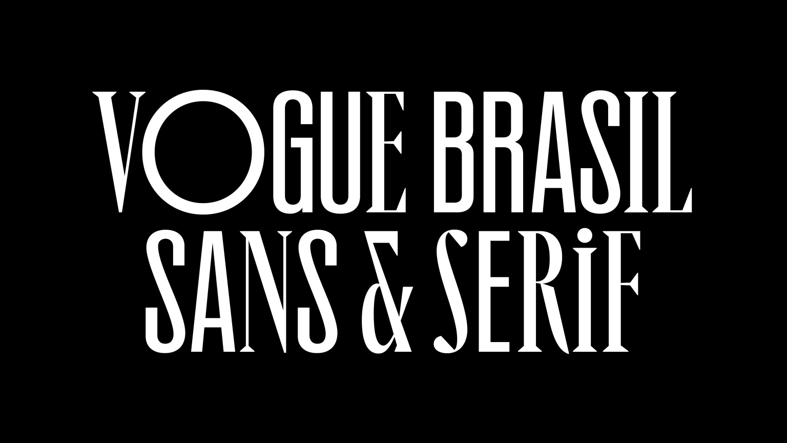
Vogue Brazil’s award-winning typeface, Vogue Brasil Sans and Serif, was specially created for the publication by Studio DRAMA.

Based on the concept of ‘elegant vernacular’, the two typefaces produce an impact by themselves and when combined. The design considers diacritics in the Portuguese alphabet, leading to an agile typeface that accommodates such use.
15. YouTube
In true YouTube fashion, the company revealed its official typeface, YouTube Sans, in a playful video.

Growing from three to seven fonts, the typeface includes a stylistic set and options for italicised and rounded characters.
Why Should Brands Create a Custom Typeface?
Although custom typefaces can be expensive, they are a worthy investment so brands can safeguard their business and corporate identity. Generic typefaces require businesses to pay licensing rights whenever they are in use, not to mention risking copyright infringement.
Moreover, a custom typeface is able to support multiple languages. Many common typefaces primarily support Latin-only languages, forcing the use of alternative types for character-rich languages.
Ultimately, brands should weigh the pros and cons of a one-of-a-kind typeface before commissioning one. More than a branding exercise or corporate flex, a custom typeface should be understood properly and incorporate the brand’s tone of voice to make it authentically theirs.


