Ovarian Cancer Action (OCA) is the UK’s leading ovarian cancer research charity, focusing on early detection, prevention, and treatment to ensure that every woman survives.
OCA is a community of changemakers with one purpose: to give ovarian cancer the focus it needs to increase 10-year survival rates. The organisation discovered the solution through world-leading research. It funds more ovarian cancer research than any other UK gynaecological cancer charity and has driven some of the biggest breakthroughs of the last 19 years, offering hope for the future. Furthermore, it is the only charity at the heart of the global ovarian cancer research community and has been for four decades.

New Identity Is Impactful and Hopeful
In its quest to accelerate progress in the fight against ovarian cancer, OCA has redefined its brand. The new identity is not just a change in appearance but a powerful symbol that inspires significant action, reaches a wider audience and aligns with the charity’s mission of saving lives through increased awareness and research.
Revolt London, a purpose-led creative agency, has been entrusted with rebranding OCA. Their role is not just to change the visual identity but also to amplify the organisation’s voice in a crowded market, thereby increasing its reach and impact.
Unmasking Ovarian Cancer
Myron Darlington, Creative Director of Revolt, explained to It’s Nice That the key to this transformation was finding a way to push the category’s visual conventions while retaining its roots.

Revolt London’s rebranding process centred on aligning a bold visual identity with the organisation’s strategic goals of robust fundraising and compassionate advocacy. The meticulous planning and execution of this alignment reassures the audience about OCA’s future direction. The challenge lay in creating a visual language that could effectively balance these seemingly divergent objectives.

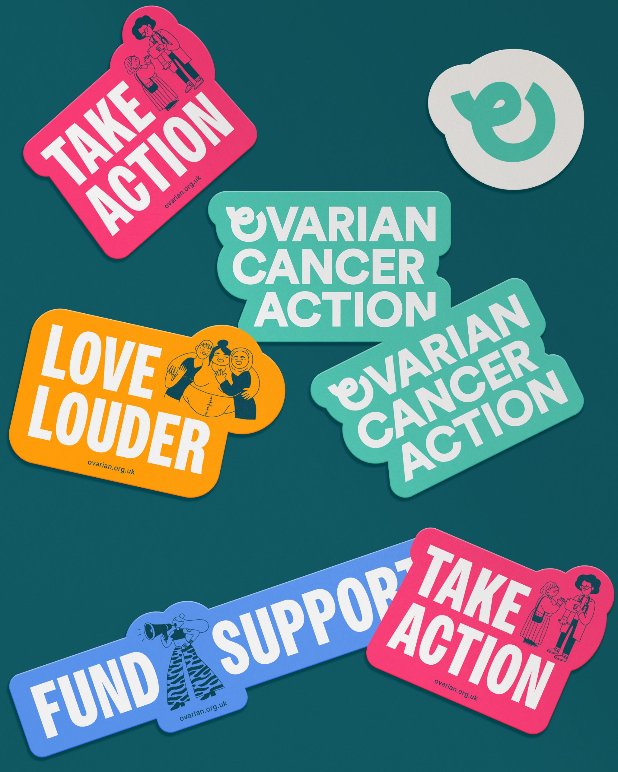
The brand’s core visual element, the ‘O’, emerged as a solution. Inspired by the universally recognised cancer symbol, the ‘O’ incorporates design cues from the cancer ribbon while also representing an ovary. This versatile graphic serves as the foundation for the logo and extends its influence throughout the charity’s visual communication, unifying the brand’s message across platforms.
A Visual Representation
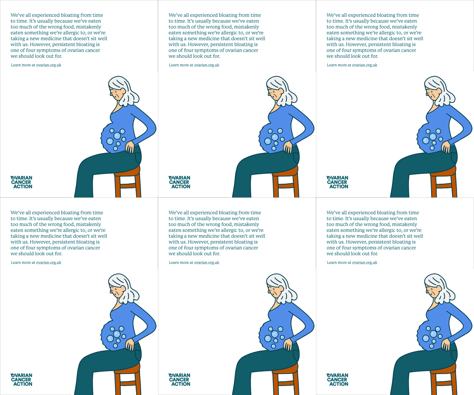
In addition, the team is partnering with French artist Cécile Dormeau to create an illustration library that perfectly captures complex emotions and narratives. Her illustrations bring a sense of warmth and relatability to the brand.

Speaking on the Creative Boom, Shahina Ahmed, Senior Designer at Revolt London, says, “Our predominantly female-led team, both at the agency and the charity, built on the inherent call to ‘action’ in Ovarian Cancer Action. The refresh reinforces their mission to make every woman a survivor and is a powerful rallying cry, emphasising the urgency for action.”

By seamlessly integrating a powerful symbol into its visual identity, Revolt London has created a brand that is both visually striking and strategically aligned. This innovative approach to branding positions OCA as a dynamic and forward-thinking organisation at the forefront of the fight against ovarian cancer.


