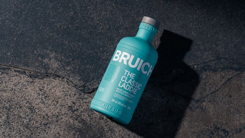
Scottish distillery Bruichladdich has introduced its new sustainable whisky bottle design and brand revamp by creative agency Thirst. Introducing a contemporary design with sustainable materials, the reform is part of the brand’s commitment to sustainable whisky.
Features of the New Bruichladdich Classic Laddie
The brief was to create a bottle incorporating Bruichladdich’s progressive and purpose-driven goals. Based on this, the team at Thirst worked backwards, beginning from the wooden pallets used to deliver the bottles up to the very material of the bottle.
Bruichladdich’s new The Classic Laddie cuts its CO2 packaging emissions by 65%, moving away from the idea of excess packaging as a measure of quality. Removing the unnecessary outer tin allows for a cleaner and more straightforward bottle appearance.
Additionally, the new and improvised Bruichladdich bottle features a smaller neck and thinner silhouette. Despite its slender hold, the bottle’s neck is designed so that the liquid inside will not splash when poured.
Besides these, the bottle uses a water-based, organic ink coating for its exterior. It also has a polypropylene closure and cork constructed from synthetic resin and bio-based sources.
On the aspect of sustainability, the old Classic Laddie contained 15% recycled glass on average, whilst its upgraded counterpart has about 60% of recycled glass. The new bottle is lighter, contains more recycled materials, and its shape allows greater transportation efficiency of 60% more bottles per pallet.
Bruichladdich’s Brand Revamp
Retaining the bottle’s pleasant aqua-blue colours, the printed graphics on the bottle take on a renewed style with a grid system. The brand’s story and evolution is a tale to excite its buyers, and the bottle also highlights its B-Corp accreditation stamp.

Keeping up with the times, The Classic Laddie also has a QR code for consumers to learn about the various initiatives supported by the brand. The whisky bottle embodies the pride of its home grounds with Islay symbols embossed around the bottle’s neck.
Moreover, the brand’s wordmark is refreshed with a new typeface and larger size on the bottle. The small yet remarkable change allows for a smoother flow between the letters, providing a seamless appearance.
Bruichladdich’s deep roots in Islay make up a substantial part of its brand story, with support for various initiatives from farming to agriculture. With its new sustainable whisky bottle, the brand hopes to pave the way for other whisky brands and to create a more sustainable industry.


