Multidisciplinary design studio Bruce Mau Design (BMD) has partnered with the McMichael Canadian Art Collection on a transformative rebrand and website redesign that repositions the beloved institution as a contemporary, vital destination for art and culture in Canada.
McMichael Canadian Art Collection
Long recognised for its storied collection, The McMichael is home to the iconic Group of Seven, Emily Carr, and Norval Morrisseau. BMD’s new identity captures their desired evolution, balancing history and modernity in a design system that feels both grounded and alive.
The McMichael Executive Director and Chief Curator, Sarah Milroy, shared, “The McMichael has undergone a tremendous transformation in recent years. While our roots remain firmly grounded in our history and the foundational artists, our vision has expanded to tell a richer, more dynamic story of art in Canada. Today, our exhibitions highlight rising contemporary artists, centuries of Indigenous artistic practice, and introduce new scholarship that redefines what ‘Canadian art’ means now. For some time, public perception hadn’t fully kept pace with this evolution. This rebrand represents a visual and verbal rearticulation of who we are now: a vibrant, inquisitive, welcoming institution with a clarity of voice and a bold commitment to championing Canadian art in all its forms.”
A New Identity for Canada’s Iconic Art Destination

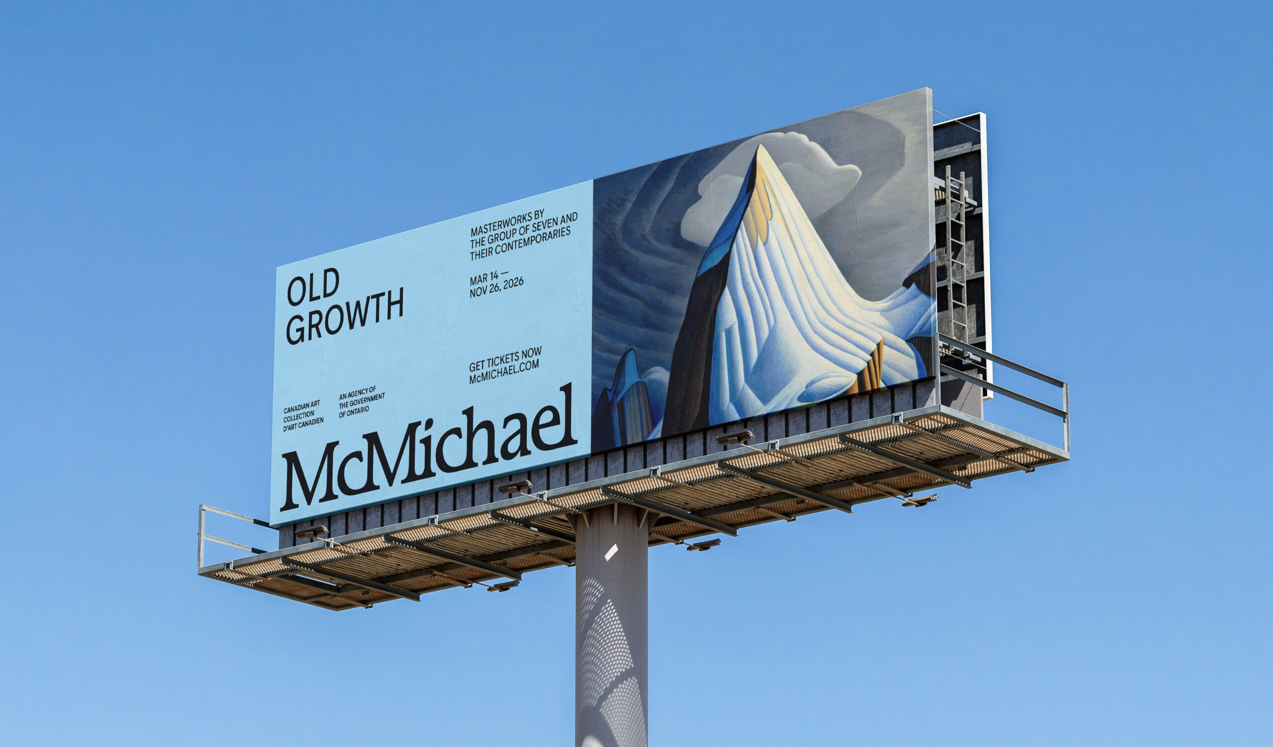
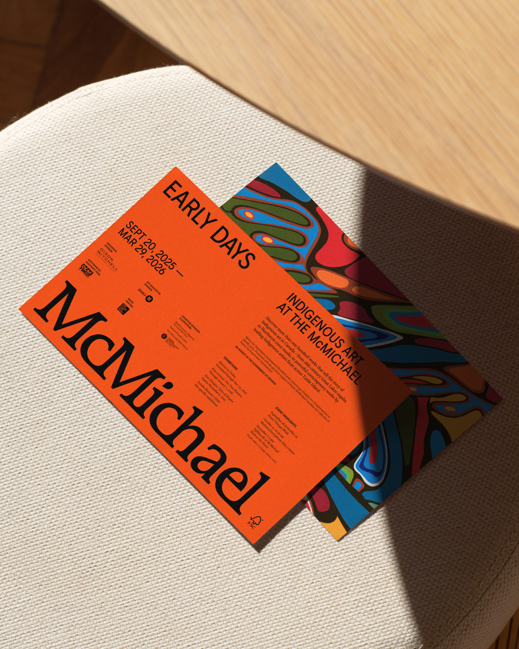
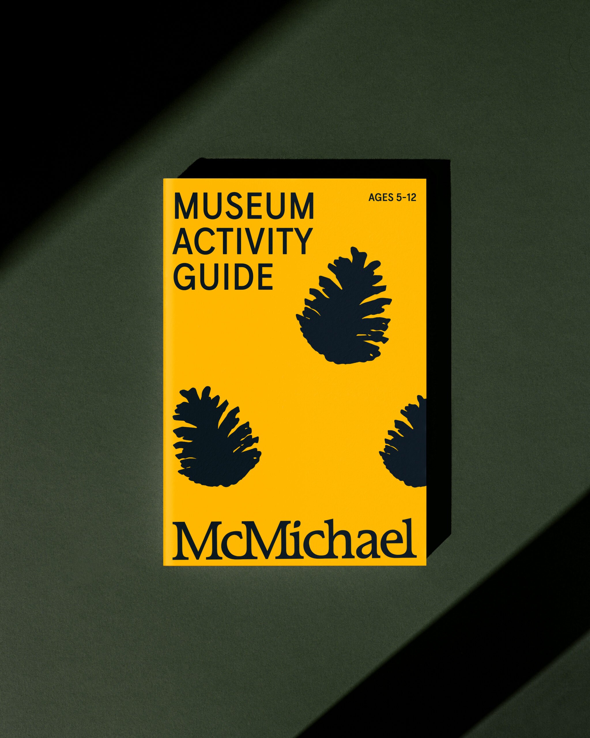
Working in close collaboration with Milroy and the McMichael team, BMD developed a comprehensive identity system that includes a redrawn heritage logo, a modern typographic suite, a vibrant color palette, and integrated motion and campaign applications. The system extends across marketing, exhibition materials, and a redesigned website that makes McMichael’s curatorial stories and programming accessible to a wider audience.

BMD Chief Creative Officer Laura Stein reflected, “We helped the McMichael articulate a big brand idea that positions them in a new way while honoring their roots. We redrew an older, handcrafted logo to preserve its warmth and paired it with a clean sans serif typeface from Canadian foundries, balanced, approachable, and timeless. The result invites discovery and dialogue across eras and cultures.”

A structured grid and bold use of color, often drawn directly from artworks, lend the identity both rigor and surprise. Typography with Indigenous syllabic support ensures inclusive communication with diverse audiences. The refreshed logo anchors communications with strength and confidence, while the color system and imagery reflect the gallery’s openness and curiosity.

“Through artist interviews and a pop-up studio with staff, we uncovered what truly makes the McMichael special: its spectacular setting, sense of welcome, and its unique way of sparking dialogue,” added Kar Yan Cheung, BMD Director of Design Strategy. “The new identity, built around an ‘invitation to explore,’ embodies that spirit, open, expansive, and engaging.”

