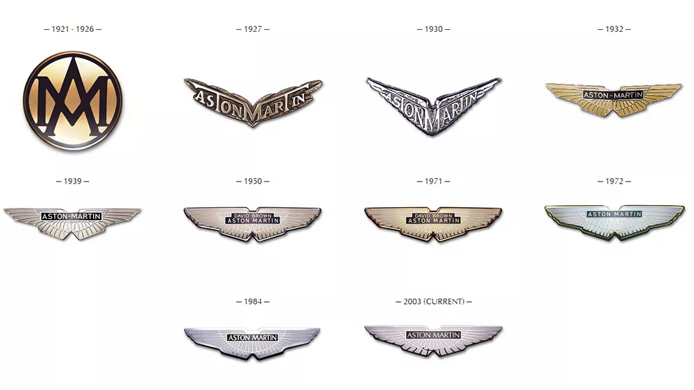
The British luxury car maker Aston Martin is known for speed and sleek design. Aston Martin, much like any manufacturer, understands that logo redesigns and adjustments are necessary to stay present in a more modern society. The luxury car maker tasked the famed graphic designer, Peter Saville CBE, to update its winged logo.
The change might not seem like a massive transformation – Saville described it as “subtle but necessary”. But it’s a lesson in logo design that respects a heritage brand while keeping it fresh and modern.

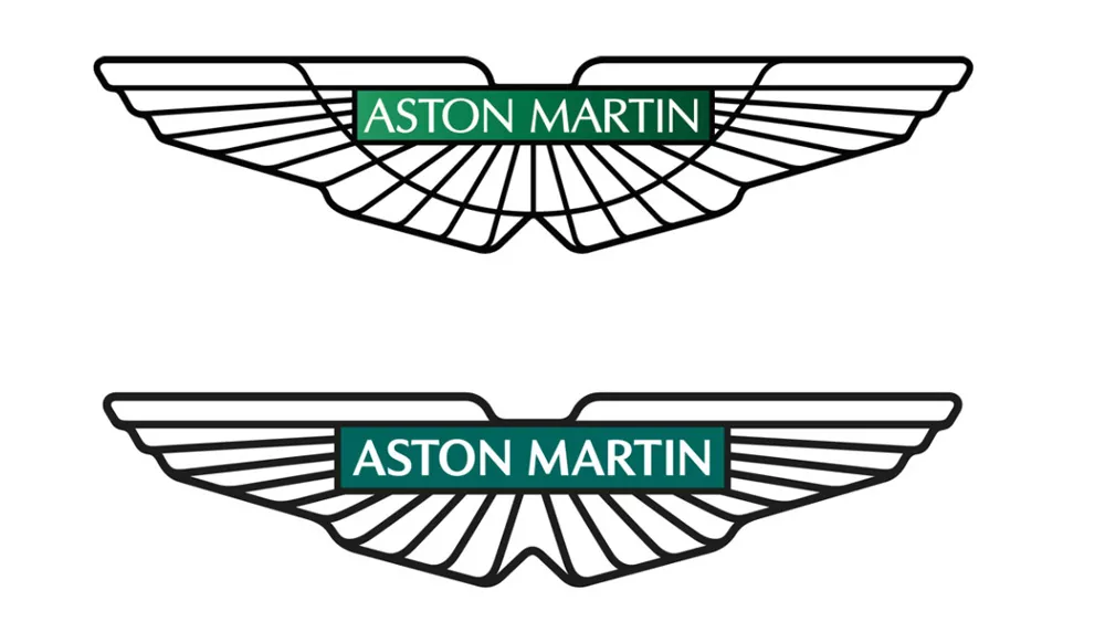
The previous Aston Martin logo looked quite busy by today’s standards with its green gradient background and fussy semi-circular line. The lines reflected the original Egyptian inspiration for the design but didn’t seem to say much about the brand today. Saville, a graphic designer most famous for his album covers for the Manchester record label Factory Records, has sensibly ditched both of those elements.

The gradient’s been replaced with a solid British racing green, and the remaining lines have been thickened. That makes the bolder, but also more streamlined and modern-looking, showing an intent to boost the Warwickshire-based company’s appeal among a younger and more international audience, while respecting the brand’s history.
As Aston Martin’s executive vice president Marek Reichman says, “every millimetre of each line – of each shape within the new wings, are drawn forward from the depths of our 109-year Aston Martin creative wellspring.”
Saville himself has described the
update as a “classic example of the necessary evolution of logotypes of provenance.” He said his tweaks were “subtle but necessary enhancements” not only to keep the logo fresh but also to allow it to be applied to new technologies and situations in the future.
The new Aston Martin logo is accompanied by a new tagline – “Intensity: Driven”


