Lyle’s Golden Syrup, a longstanding presence in British kitchens for over 150 years, recently rebranded its logo to refresh its appeal to contemporary shoppers.
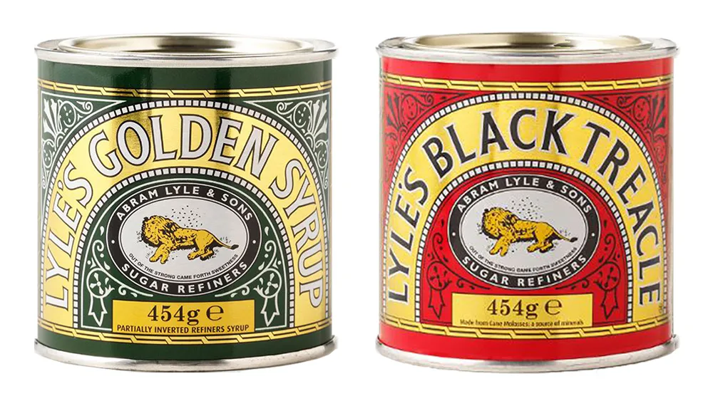
The brand producers have opted to modify its iconic logo, which features an image of a deceased lion encircled by bees.
The Meaning Behind the Original Logo
The founder of Lyle’s Golden Syrup, Scottish businessman Abraham Lyle, conceived the original packaging design and chose to incorporate a Christian analogy on the tins.
As per the company’s website, Lyle held firm religious beliefs, explaining the logo’s portrayal of the Samson story from the Old Testament. This narrative tells Samson’s encounter with a lion, his subsequent victory over it, and the discovery of a honeycomb formed by bees in the carcass. Samson later crafted a riddle from this experience: “Out of the eater came forth meat, and out of the strong came forth sweetness”.
On top of that, the original logo stands as the world’s oldest unchanged brand packaging since 1888, acknowledged with a Guinness World Record.

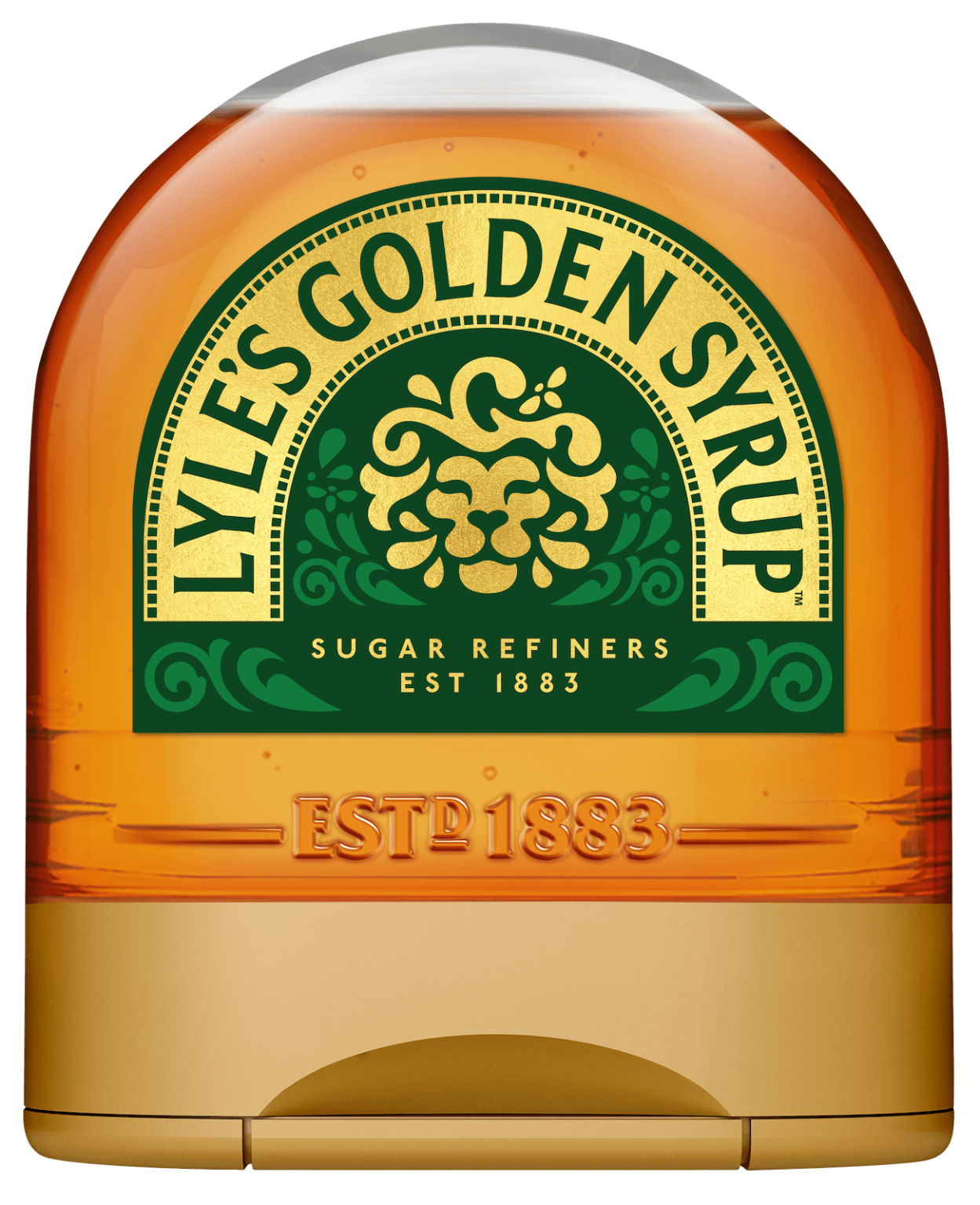
Lyle’s Golden Syrup’s New Logo

The updated branding will showcase a redesigned lion’s head paired with a single bee, adorning various products such as the brand’s full-sized bottles, breakfast bottles, dessert toppings, and golden syrup portions. Furthermore, the new logo will also feature on the latest plastic ‘squeezy’ bottles.
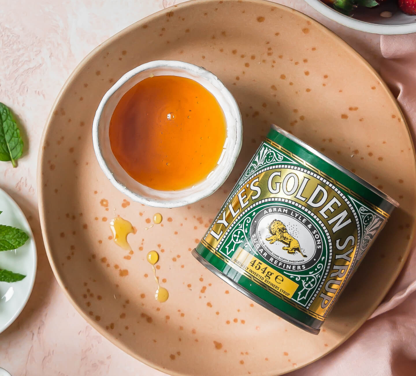
Nevertheless, the classic Lyle’s Golden Syrup tin will not undergo the rebranding process, ensuring the preservation of its iconic, timeless packaging design. This move maintains the nostalgia for loyal customers who have been with the product for ages.

The brand director, James Whiteley, said the brand needed to show consumers it was moving with the times and meeting their current needs.
Brand director for Lyle’s Golden Syrup, James Whiteley, shared the company’s excitement about the fresh redesign,
“Our fresh, contemporary design brings Lyle’s into the modern day, appealing to the everyday British household while still feeling nostalgic and authentically Lyle’s.”
“We’re confident that the fresh new design will make it easier for consumers to discover Lyle’s as an affordable, everyday treat while re-establishing the brand as the go-to syrup brand for the modern UK family, featuring the same delicious taste that makes you feel Absolutely Golden.”
Connecting Past and Present: Lyle’s Golden Syrup Visual Evolution
The importance of rebranding a product like Lyle’s Golden Syrup goes beyond just updating its visual identity. Rebranding is a strategic move that allows a brand to stay relevant in a dynamic and ever-evolving market.
Capturing A New Generation of Consumers
In the case of Lyle’s, the decision to refresh its logo after more than a century serves as a response to shifting consumer preferences and contemporary design trends. By embracing a modern look while retaining its classic elements, Lyle’s aims to capture the attention of a new generation of consumers while maintaining a connection with its loyal customer base.
Commitment to Inclusivity and Adaptability
Additionally, rebranding can also be a response to societal changes and sensitivities. In this instance, the rebranding was made due to concerns about the perceived offensiveness of the previous design to younger audiences. It demonstrates a brand’s awareness and responsiveness to societal values, showcasing a commitment to inclusivity and adaptability.
Staying Relevant in Evolving Market
Ultimately, the importance of rebranding lies in its ability to revitalise a brand, strengthen its market presence, and ensure its continued relevance in the hearts and minds of consumers. It’s a strategic investment reflecting a brand’s adaptability and dedication to staying connected with a diverse and evolving audience.
A Strategic Move
In short, the recent rebranding of Lyle’s Golden Syrup marks a significant shift in its visual identity. The decision to update the iconic lion logo with a single bee on certain products reflects a contemporary approach while retaining the brand’s rich history.
This careful balance between modernisation and nostalgia showcases a strategic effort to appeal to a diverse consumer base. As Lyle’s Golden Syrup continues to evolve, it demonstrates a commitment to adapting to changing consumers’ preferences while honouring the enduring legacy that has made it a cherished part of culinary traditions for generations.


