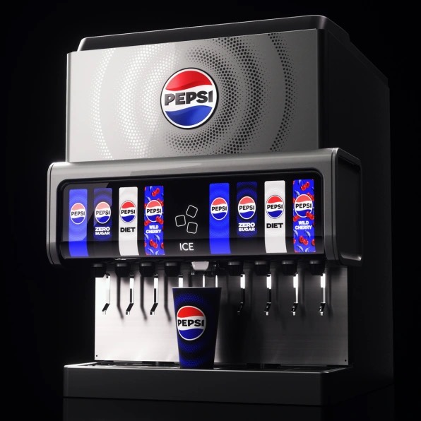
Yes, it’s happening after 15 years! This revelation of the new Pepsi logo has come to its origin after 2008.
Pepsi has witnessed an incredible journey with its one billion daily users and territory extension to over 200 countries. Now that it has announced the unveil of its new Pepsi logo, its consumers are showering overwhelming responses.
This integration of the new logo will remind its consumers about the brand’s classic labeling. Moreover, the first glimpse of this logo will deliver a black-bordered circle along with red, white, and electric blue stripes. Unlike the old logo, it uses a bold “PEPSI” in a linear font on a white background.
Explaining the thought process behind the new Pepsi logo, Pepsico’s Chief Designer said, “The goal in reimagining the logo was to infuse great energy and confidence and boldness.”

On this new rendition, many people believe that Pepsi has not looked this good in decades. Moreover, this new version will roll out in 2024 for the public.
Yet this new brand logo explicitly cut off association with sugar-loaded Pepsi cans by introducing diet Pepsi. Also, the Pepsi design team includes a ‘pulse’ right after the globe icon. According to designers, this ripple pattern will animate to any background beat.
Explaining this, CMO of Pepsi, Todd Kaplan said, “A lot of people don’t even notice the black is there. It’s an intentional color we added in with [Pepsi] Zero Sugar (diet Pepsi), which will be the lead brand we use in marketing. [Black] can act as a master brand statement.”
Over the years, the Pepsi logo has been subjected to the global trend. In 1998, it accepted the glitzy texture. In 2008, flat and mute colors were popular among millennials, and now 2023 has introduced a bold and digital animation.
Nevertheless, we expect that this black and blue pulse pattern will bring a fresh animation and connects with consumers.


