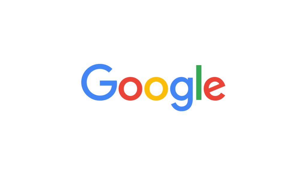
Search Giant Moves to Sans-Serif in Major Change After 17 Years
Search behemoth Google has a new logo, opting for a rounder, thicker face, and for the first time, introducing a san-serif face.
The change was rolled out globally on 1 September 2015, and was introduced via an animated GIF on its search website.
So, what brought on the change? In a blog post, of Google explained, “Once upon a time, Google was one destination that you reached from one device: a desktop PC. These days, people interact with Google products across many different platforms, apps and devices— sometimes all in a single day. You expect Google to help you whenever and wherever you need it, whether it’s on your mobile phone, TV, watch, the dashboard in your car, and yes, even a desktop”.
The brand is also replacing the little blue “g” icon and replacing it with a four-colour “G” that matches the new logo.
The new design will roll out across all Google products progressively.
There has been a mixed reaction on the interweb to the change, with some praising the new design while others were not impressed. Time will tell. In any case, the world uses Goggle and this is what the new Google will look like, for now.


Average Rating