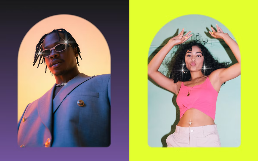
Snipfeed has unveiled a new visual identity, designed by London-based Studio Nari, to coincide with the announcement of a new premium service, Snipfeed Pro.
The new identity has a blingy edge that chimes with the brand’s ongoing mission to “economically empower creators”, which it felt was missing from its previous branding and digital presence.
Rather than draw on the dry images associated with finance, however, the new identity aims to evoke a “life without limits” mentality, according to the company.
Images of skies run throughout the new visuals, and design elements have also been arranged as though they’re floating mid-air.

At the heart of the redesign is an enjoyably chunky, chrome interpretation of the brand wordmark, as well as an ‘S’ icon that features a cut-out in the shape of a twinkle within the letterform – a motif picked up throughout the rest of the identity. Unusually, hovering over the wordmark on the brand’s website reveals a second, splodgy design.
Emojis have also been transformed into 3D badges, alongside a suite of other playful symbols and illustrations, all created by River Cousin, that appear across the refreshed website.
‘Link in bio’ platforms first cropped up as a way of hosting multiple links in one place, which quickly proved to be a handy workaround for the limited number of URLs that people could include in their social media bio. Since the rise of social media marketing and the online creator economy, the capabilities of ‘link in bio’ services have only continued to grow.


