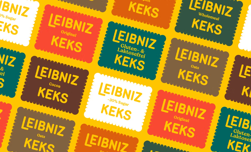
Auge Design was tasked with creating a new and appealing visual identity for Leibniz, the infamous biscuit brand. Auge takes the biscuit into a new generation and reimagines its branding and packaging design in a colourful and delicious way.
Founded in 1889 by Hermann Bahlsen, German family enterprise Bahlsen is one of Europe’s most successful confectionery companies.
Arguably its most famous brand is Leibniz, which is instantly recognisable thanks to its teeth-shaped design and the ‘Leibniz Butterkeks’ typeface imprinted on the biscuit.
Auge Design was tasked with bringing the biscuit to a new generation when it came to reimagining its branding and packaging design. By using a close-up photography style looks to enhance the biscuit’s texture and makes the individual flavours recognisable at first glance, showing consumers exactly what is inside the box.
The original Leibniz biscuit was the main source of inspiration for the new branding, and in particular the rounded style of the logo.

“We started by working deeply on the logo, cleaning it from useless and superfluous elements, adding a baked effect to each letter, through ink-traps inspired by the shapes of Leibniz biscuits,” says Auge Design creative partner, Davide Mosconi.
A new custom typeface, ButterKeks Display, was developed from the logo design in order to be able to maintain typographic consistency across the various Leibniz ranges.


