In today’s hyper-connected digital landscape, brands must innovate to stay relevant, but that journey is rarely smooth sailing. When a rebrand falters, what begins as a promising new chapter can quickly become a battlefield for public scorn and backlash.
This article delves into five notable instances of brand rebrands sparking significant online backlash, highlighting the challenges of navigating brand evolution in the digital age.
1. Twitter to X (2023)

What Happened: Elon Musk rebranded Twitter to “X,” removing the iconic blue bird logo and shifting the platform’s identity entirely.
Public Reaction: The decision faced widespread criticism and confusion. Users lamented the loss of the bird logo, questioned the rationale behind the change, and criticised the potential alienation of the platform’s core user base. Many viewed the move as an unnecessary erasure of a globally recognised brand.
Outcome: Although met with ongoing criticism and user dissatisfaction, the transition to X has been set in motion. Its long-term influence on engagement and brand perception is yet to be seen.
2. Jaguar’s Concept Car Controversy (2024)

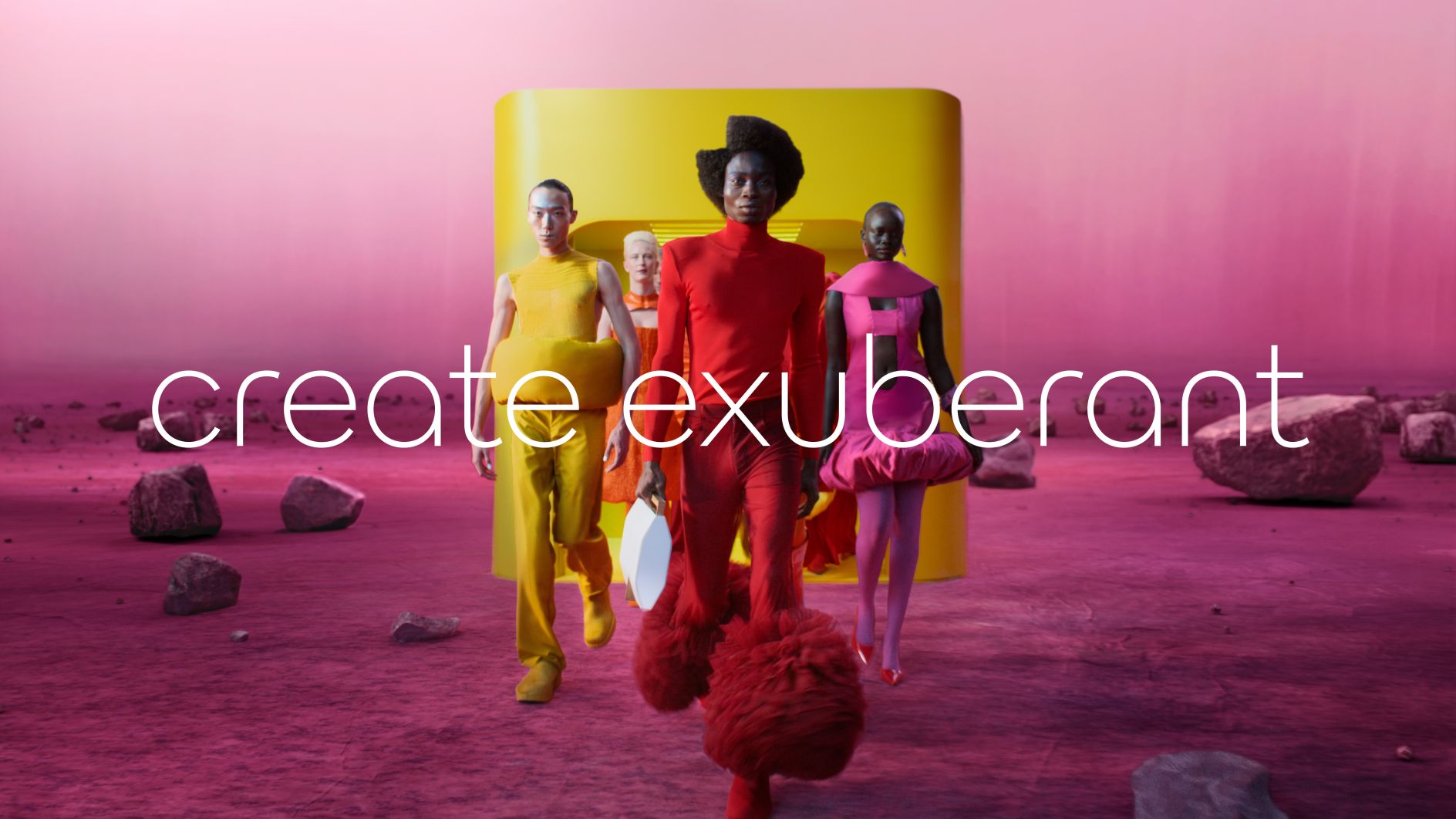
What Happened: In 2024, Jaguar unveiled a new brand campaign focusing on “exuberant modernism” without featuring any actual cars, aiming to highlight its shift towards electric vehicles.
Public Reaction: The campaign was criticised for being overly abstract and disconnected from the brand’s core product. Many fans and industry experts labelled it “woke” and questioned the absence of vehicles in the rebranding effort.
Outcome: Responding to the backlash, Jaguar released a concept design for its next-generation electric vehicle, the “Type 00,” to realign the brand’s image with its automotive roots.
3. Walmart Rebranding Backlash (2024)

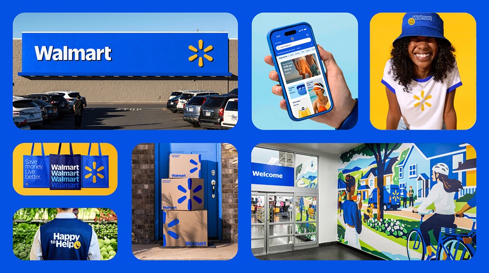
What Happened: At the start of 2024, Walmart unveiled a contemporary logo and store design with a minimalist feel to appeal to a more upscale, youthful demographic. The update included swapping the established blue and yellow signs for a subtle grey and white palette and revising employee uniforms.
Public Reaction: The rebranding was met with significant online backlash, particularly on platforms like X and Facebook. Many long-time Walmart customers expressed confusion and dislike for the new look, finding it sterile and unwelcoming. Some users joked that the new design made Walmart look like a hospital or an office building, while others lamented the loss of the familiar, cheerful branding. The perceived shift away from their core customer base was a common point of criticism.
Outcome: While Walmart has taken note of the criticism, as of late March 2025, no plans have been announced to undo the rebranding. The company explains that the new look is integral to its long-term vision to update the brand and improve customer experience despite ongoing negative online feedback.
4. Burberry’s Bond Street Station Takeover (2023)
What Happened: In September 2023, Burberry temporarily renamed London’s Bond Street tube station to “Burberry Street” as part of a marketing campaign for London Fashion Week.

Public Reaction: The new rebranding was widely condemned, with commuters struggling to adjust to the unfamiliar signage and even missing stops. Many saw Burberry’s update as a tone-deaf, out-of-touch marketing stunt rather than a thoughtful evolution.

Outcome: Facing public backlash, Burberry reverted the station’s name to Bond Street shortly after the campaign.
5. Burberry’s Logo Reversion (2023)

What Happened: In early 2023, Burberry reverted to its classic Equestrian Knight logo and introduced a new serif font, moving away from the minimalist sans-serif design adopted in 2018.
Public Reaction: The rebranding received mixed reactions. While some appreciated the return to heritage, others felt the change was unnecessary and questioned the consistency of the brand’s identity.
Outcome: Burberry continued with the rebranding, aiming to reconnect with its British heritage and appeal to a broader audience.
Conclusion
Rebranding enables companies to stay up-to-date, draw in new audiences, and rejuvenate their image. Yet, changing well-established symbols like logos or slogans can risk alienating loyal customers, a challenge intensified by today’s instant online feedback. When criticism isn’t promptly addressed, its amplification on social media can severely impact a brand’s reputation. For rebranding to be successful, it is crucial for brands to thoughtfully address audience sentiments, turning potentially divisive changes into constructive evolution.


