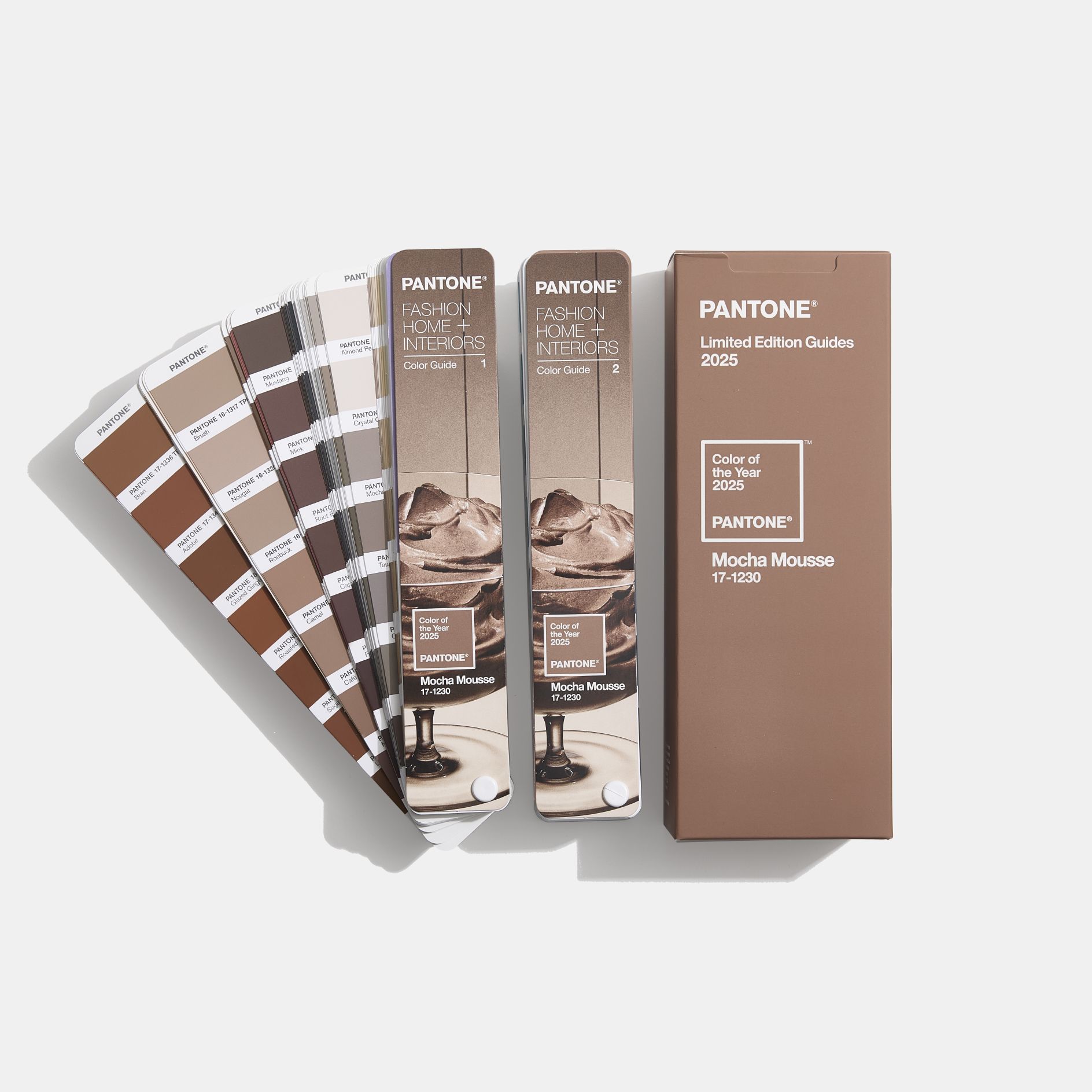
Pantone, the renowned authority on colour, has unveiled its Colour of the Year for 2025: Mocha Mousse.
Why Mocha Mousse?
According to Pantone, PANTONE 17-1230 Mocha Mousse is not just a colour; it’s a versatile tool for your creative palette. Its sophisticated, earthy elegance can stand alone or serve as a versatile foundation, enhancing a wide range of palettes and applications, from minimalist to richly detailed designs across all colour-focused industries.
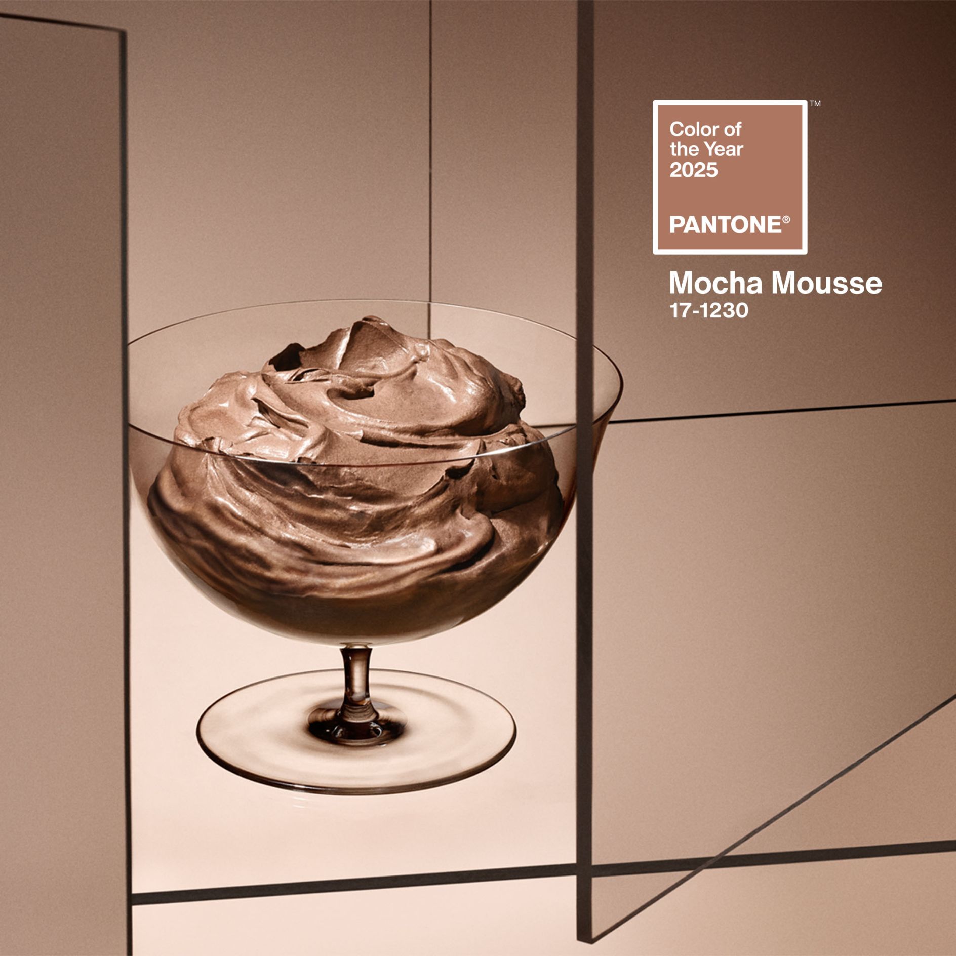
Whether aiming for a minimalist or richly detailed aesthetic, Mocha Mousse can elevate your designs. Its adaptability suits various industries, from fashion and interior design to product packaging and graphic arts.
Laurie Pressman, the Vice President of the Pantone Colour Institute, said, “For Pantone Color of the Year 2025, we look to a mellow brown hue whose inherent richness and sensorial and comforting warmth extends further into our desire for comfort, and the indulgence of simple pleasures that we can gift and share with others.”
How Will Mocha Mousse Shape 2025?
Mocha Mousse is expected to influence various aspects of design and lifestyle in 2025. Here’s how:
- Interior Design: This colour can be incorporated into home decor through furniture, textiles, and wall paint. It pairs well with neutral tones like beige and cream, as well as bolder colours like deep blues and greens.
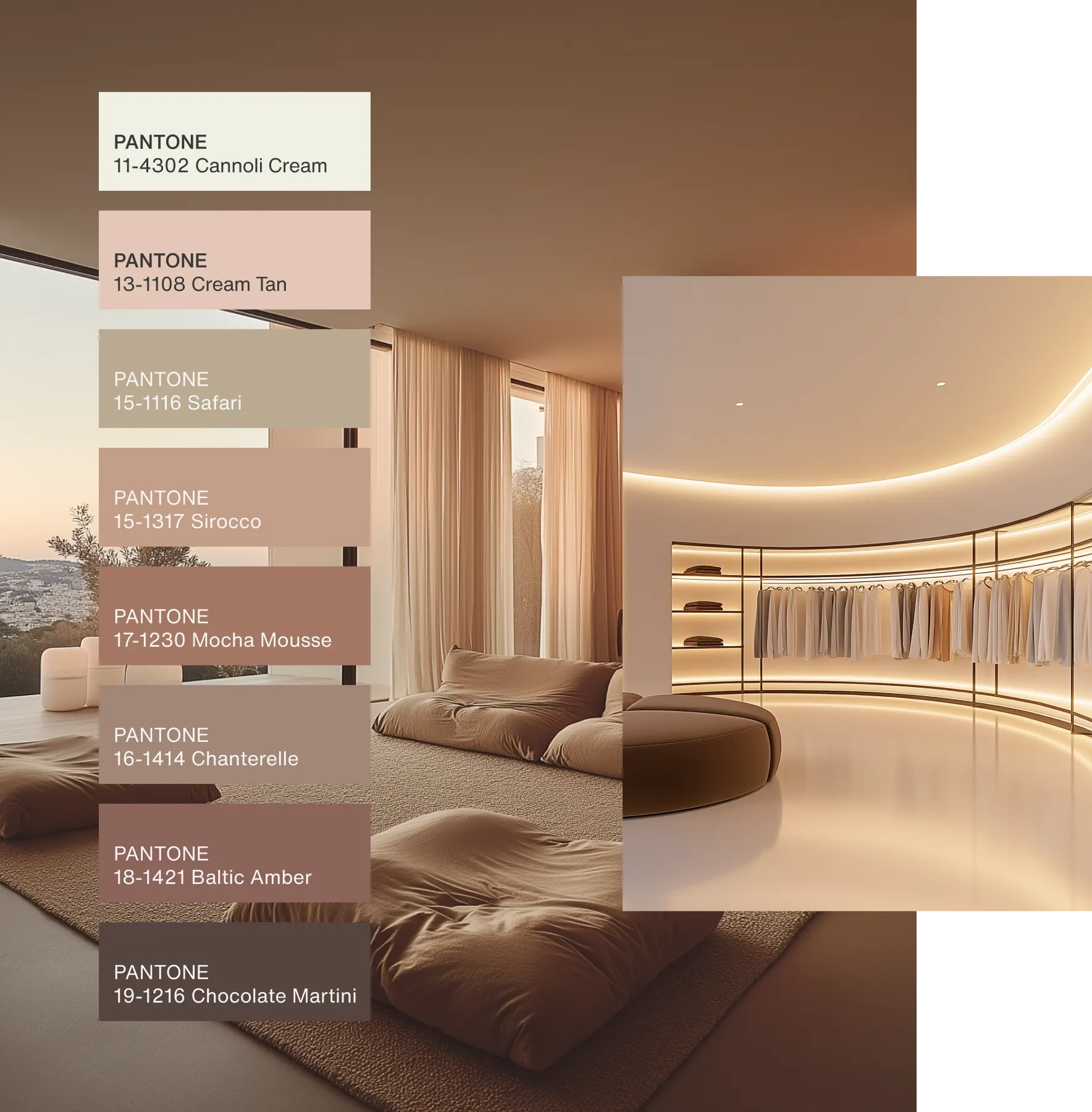
Image source Pantone - Fashion: Mocha Mousse can be seen in clothing, accessories, and footwear. It’s a versatile colour that can be dressed up or down, making it a popular choice for both casual and formal wear.
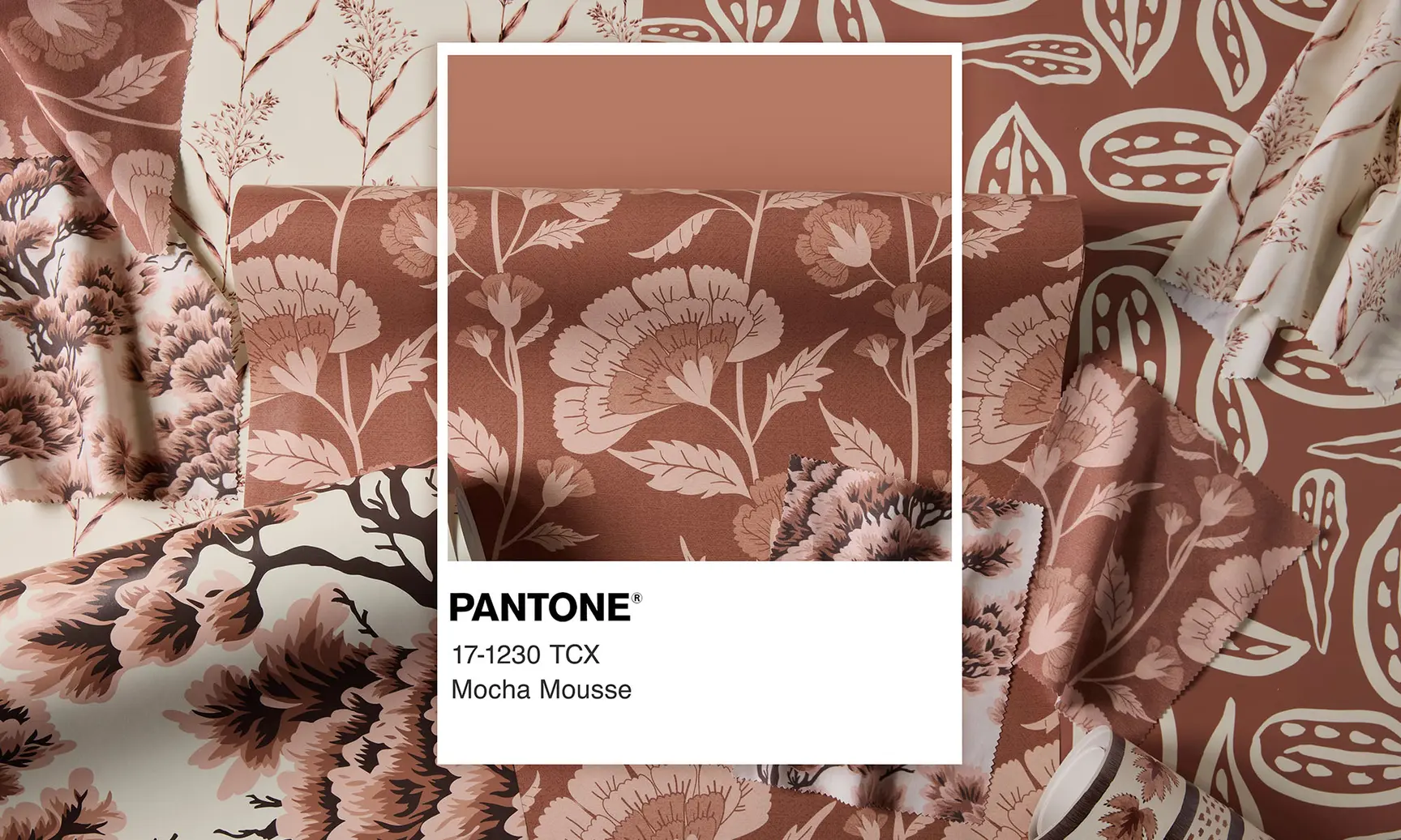
Spoonflower x Pantone® Image source Pantone - Product Design: From electronics to beauty products, Mocha Mousse can add a touch of elegance and sophistication. It’s a colour that can be used to create a sense of luxury and exclusivity.
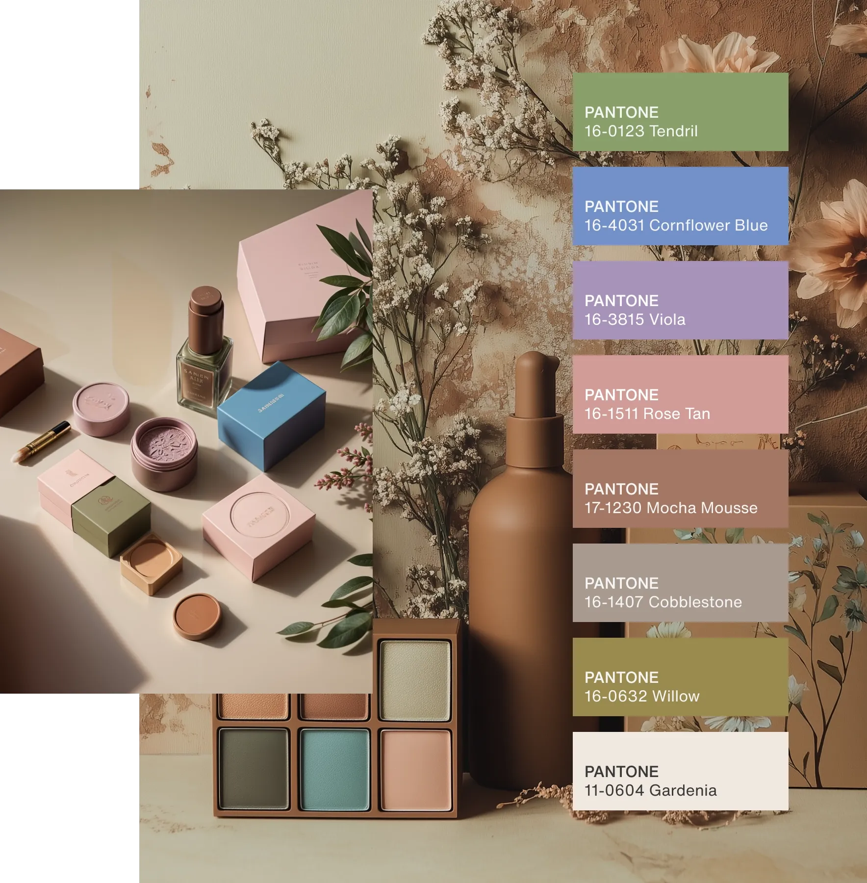
Image source Pantone
A Muted Hue: The Less Exciting Side of Mocha Mousse
While Pantone’s choice of Mocha Mousse for Colour of the Year 2025 offers a comforting and grounding tone, it also raises concerns about a potential shift towards a more muted aesthetic. Some critics argue that this colour choice might lead to a less vibrant and exciting design landscape.
A neutral brown Mocha Mousse can be perceived as somewhat bland and uninspiring. It lacks the vibrancy and energy of previous Colour of the Year selections. This could potentially lead to a more subdued and homogeneous design aesthetic, where creativity and boldness take a backseat.

While there’s undoubtedly a place for calming and comforting colours, it’s essential to strike a balance. A world dominated by muted tones might lack the visual stimulation and emotional impact that vibrant colours can provide. This reminder of balance reassures and guides us in our design choices.
A Balanced Perspective on Mocha Mousse
As we delve into 2025, Pantone’s Colour of the Year, Mocha Mousse, offers a unique blend of warmth and sophistication. While its earthy tone provides a comforting and grounding influence, it’s essential to acknowledge the potential for a more subdued aesthetic landscape.
While some may find the colour’s muted nature to be somewhat limiting, it also presents opportunities for creative exploration. When paired with vibrant accents or used in minimalist designs, Mocha Mousse can create striking and elegant visual effects. The impact of this colour will depend on how designers and consumers choose to incorporate it into their lives.


