Impossible Foods, a leader in plant-based meat alternatives, has undergone a massive rebranding and repackaging endeavour to win over meat lovers.

Beyond Color: Unveiling Impossible Foods’s Ambitious Vision
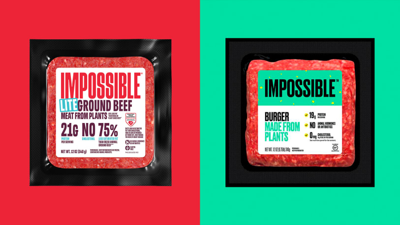
A bold new red aesthetic lies at the core of Impossible Foods’ brand refresh. It is not just about ditching the green-vegan-associated colour. Instead, it directly reflects their core mission: creating plant-based meat that rivals its animal counterpart in taste and nutrition.
The company has stated that the newly unveiled red packaging is crafted to attract individuals who consume meat or are transitioning to a more flexitarian diet, prioritising plant-based foods while reducing meat intake, though not entirely eliminating it.
Crafting Impact: The Deeper Meaning Behind Impossible’s Redesign
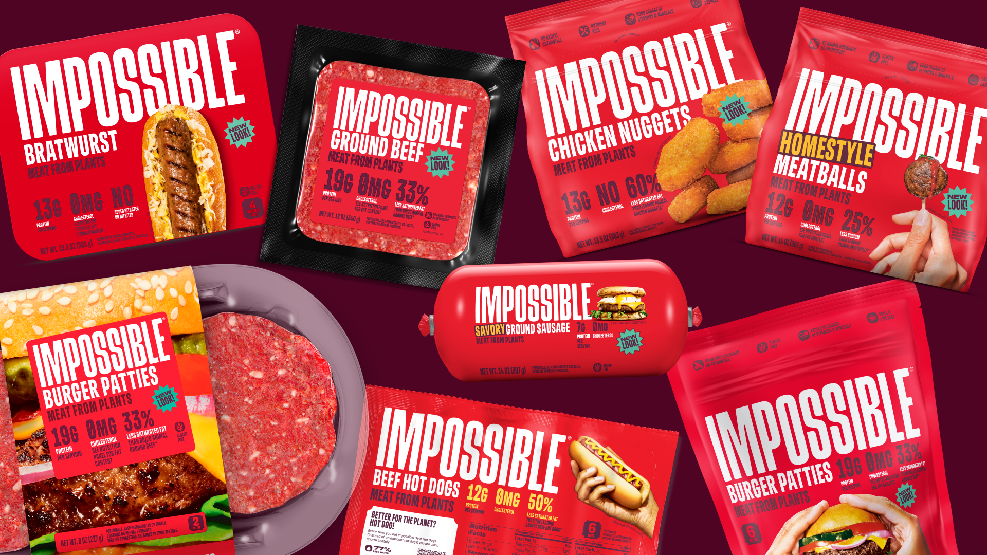
The Californian-based company partnered with globally acclaimed Jones Knowles Ritchie (JKR), a creative agency that has worked with other major food brands like Burger King and Dunkin’.
‘The design intention is to appeal to the carnivorous cravings of meat eaters across the full consumer journey, from the digital experience to most consumers’ first impression of a brand: packaging. On-shelf, the bold red packaging reinforces the fact Impossible products taste, cook and satisfy like meat from animals.’
The new updated packaging will hit shelves throughout the US over the coming weeks before continuing overseas later this year.
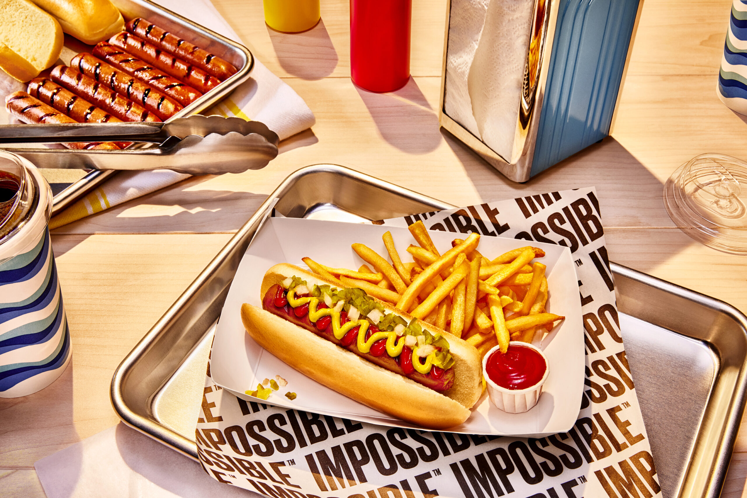
The highly-anticipated Impossible™ Beef Hot Dog will be the first new product to feature the latest red packaging.
How the Rebranding Will Shape Impossible Foods’ Future
This rebranding initiative is poised to impact the brand in several key ways:
1. Enhanced Appeal to Meat Eaters:
By embracing a striking red aesthetic and emphasising its products’ taste, nutrition, and sustainability, the brand aims to attract a broader audience, including meat eaters who may be reluctant to try plant-based alternatives.
Thus, the rebranding sends a clear message that their products are not only delicious but also comparable or superior to traditional meat options.
2. Increased Market Penetration:
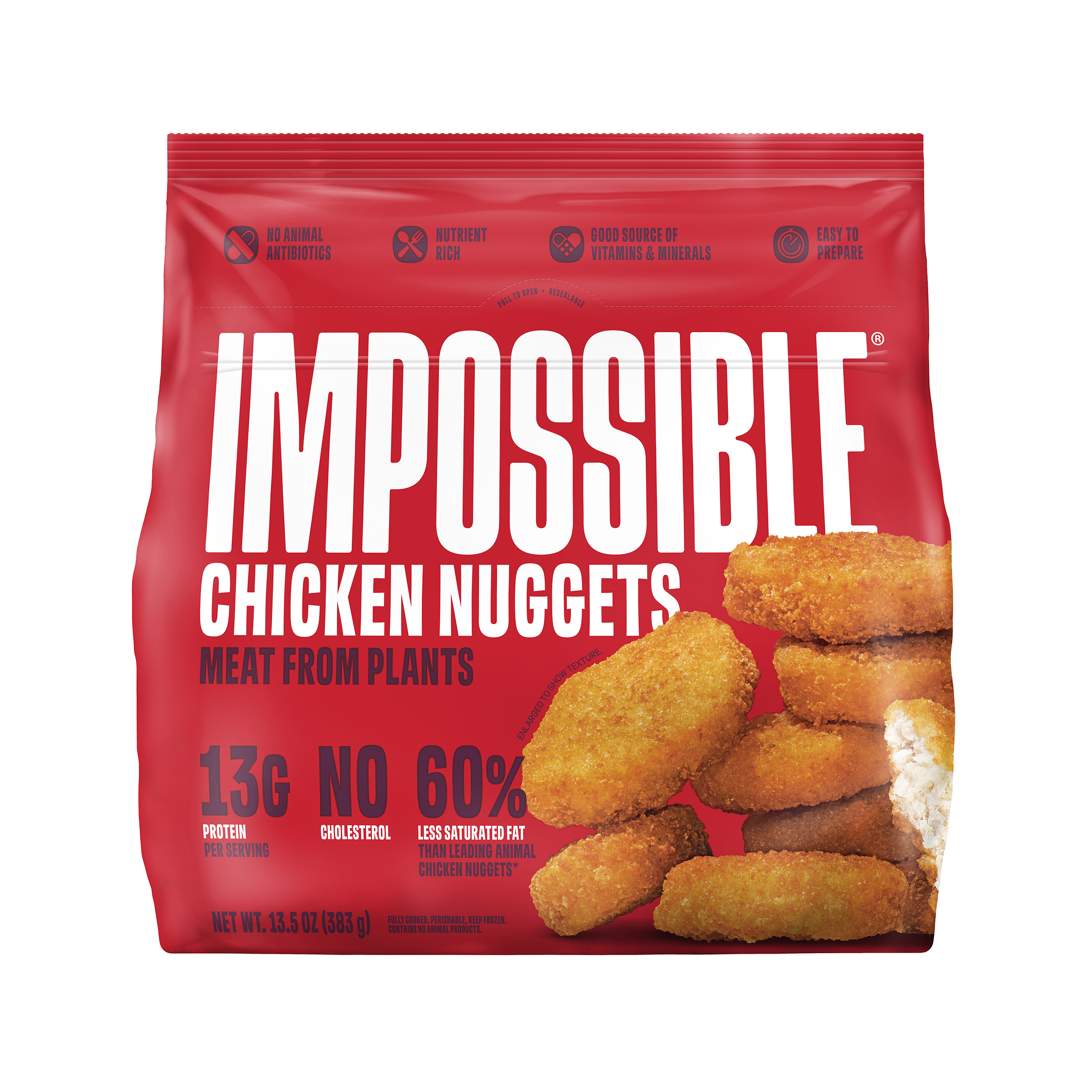
The company’s announcement arrives amidst Impossible’s ongoing expansion, surpassing the growth rate of the broader US plant-based meat category in both dollar sales and unit sales.
The company is the fastest-growing brand in the US plant-based meat category and remains the sole major brand sustaining consistent growth. It is driven by heightened velocity and distribution across its extensive network of over 30,000 retail stores and 45,000 food service locations.
As the company continues to outpace the growth rate of the overall plant-based meat category in both sales and distribution, the rebranding efforts will likely further accelerate its market penetration.
3. Reinforced Brand Identity:
The rebranding is also poised to strengthen the company’s brand identity and differentiate it from competitors. Moreover, this rebrand solidifies its position as a bold innovator in the plant-based meat industry. Consequently, it helps build trust and loyalty among consumers.
On top of that, the revamped packaging and messaging are designed to resonate with consumers across a wide range of demographics, leading to increased visibility and adoption of their products.
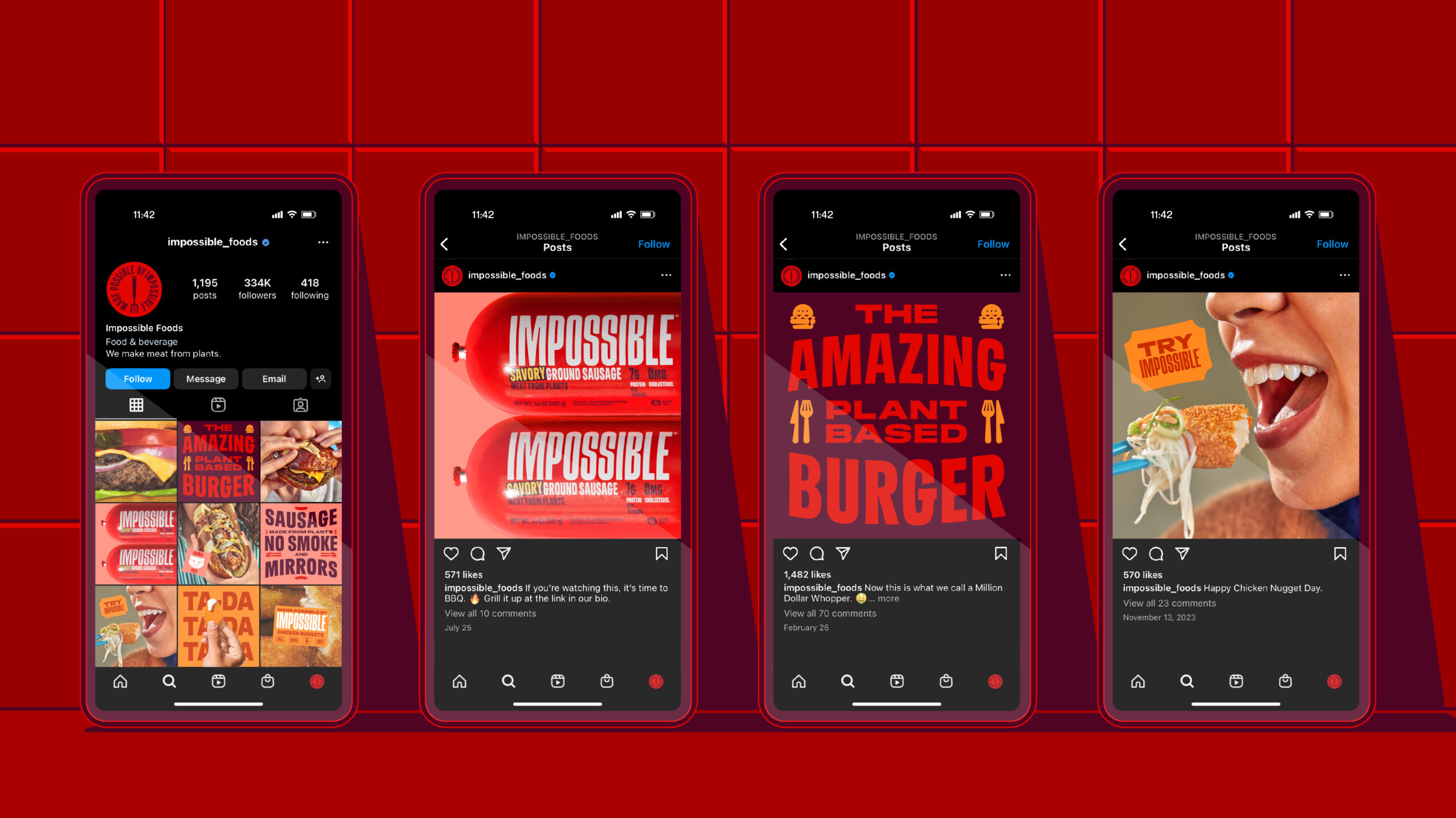
4. Driving Consumer Engagement:
The rebranding allows the brand to engage with consumers more deeply and communicate the values that drive their business.
Additionally, the company can foster a sense of community and connection with its audience through marketing campaigns and social media initiatives centred around the new branding, further driving brand loyalty and advocacy.
A New Dawn for Impossible Foods
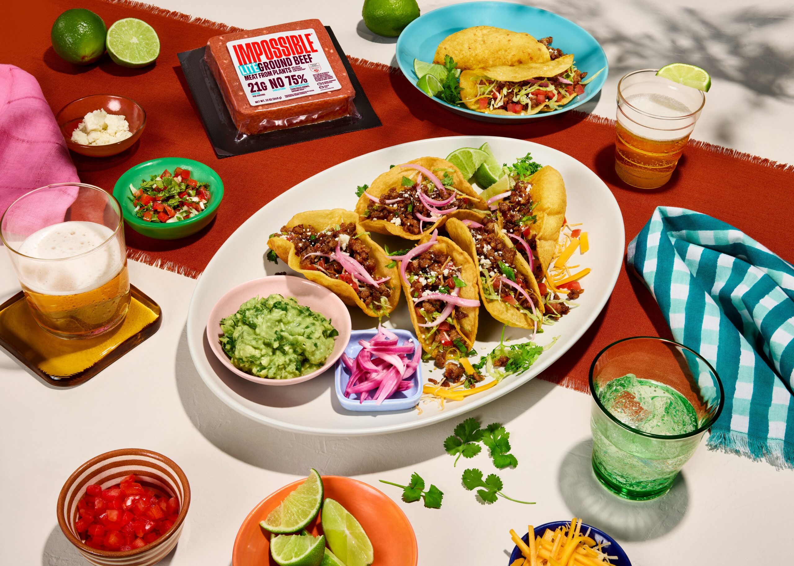
The era of niche appeal and alternative market positioning is over for Impossible Foods. Instead, the company boldly embraces a new identity tailored for the mainstream audience.
Impossible Foods is ready to captivate discerning consumers worldwide with sleek, modern packaging designs and compelling messaging highlighting flavour, nutrition, and environmental responsibility.
In essence, Impossible Foods’ ‘meatier’ makeover goes beyond branding. It signals the dawn of a fresh era characterised by culinary innovation and conscious consumption.


